Media
About
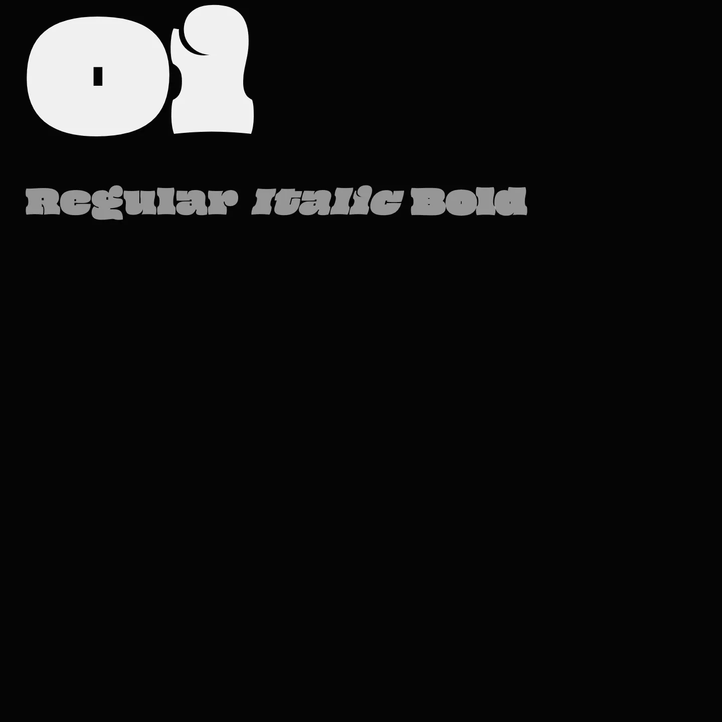
Oi draws inspiration from historic grotesque slab serifs like Caslon’s Ionic and Clarendon, offering a whimsical and loud display presence. Its design embodies a spirited and expressive character, making it ideal for striking headlines and signage. The typeface supports multiple scripts including Latin, Cyrillic, Greek, Arabic, Tamil, and Vietnamese, available in a single regular weight.
Overview
Oi is an ultra-fat display typeface rooted in the grotesque slab serif tradition of the mid-19th century, specifically influenced by Caslon’s Ionic and the Clarendon style from the Fann Street Foundry. It features a bold, twisted interpretation of these clarendonesque forms, designed to command attention with a loud and whimsical voice. The name "Oi" reflects its nature as a typographic shout, an interjection used in various languages to call attention or express challenge. This single-weight font supports a wide range of scripts, including Latin, Cyrillic, Greek, Arabic, Tamil, and Vietnamese, making it versatile for diverse typographic needs.
Designer: Kostas Bartsokas
Usage
"" Access one-stop/oi using the OneStop MCP.If you do not have the OneStop MCP, read the MCP setup docs.