Media
About
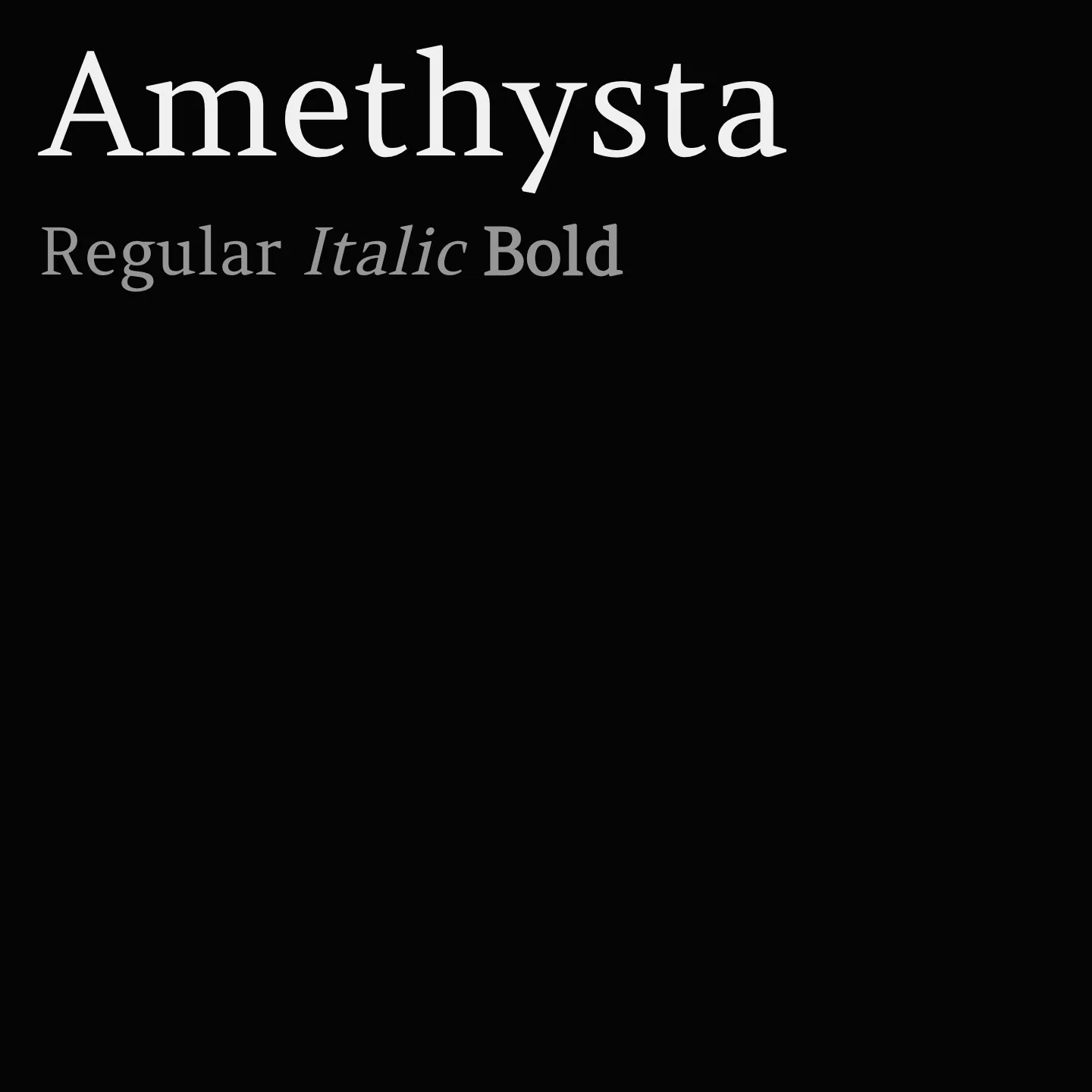
Amethysta features minimalistic wedge serifs and terminals, creating a simple yet strong impression suitable for small to medium text sizes. Its proportions align closely with the transitional serif group, making it effective for print applications where clarity on lower quality paper is essential.
Overview
Amethysta was designed by Konstantin Vinogradov with the purpose of printing on low quality paper in mind. This is why it has such minimalistic wedge serifs and terminals. It builds the impression of a simple and strong text typeface. In terms of proportions it is closely related to the transitional serif group. Amethysta is suitable for small to medium sizes, while some details will be noticeable at larger sizes. It also will work well in print.
Designer: Cyreal
Similar fonts:
- Fenix
- Martel
- Alike
Usage
"" Access one-stop/amethysta using the OneStop MCP.If you do not have the OneStop MCP, read the MCP setup docs.